
User Onboarding
Redesigning how business owners grant access to their security system
Project Overview
Project Scope
Workflow Redesign
Tools
Figma, Miro, Jira
Role
UX Designer
Challenge
This project aimed to streamline the user onboarding process for a customer-facing security app used by small to medium-sized businesses. The app allows users to monitor and connect to their business security system in order to; arm or disarm the system, control lights, locks, thermostats etc. Overtime more user features and permissions were added and the workflow became scattered and unintuitive.
My role on this project was to understand the current requirements of the typical user and redesign the onboarding experience of adding new user profiles to the app. The project team consisted of myself, a product manager, and three engineers.
Redesigned User Onboarding
Continue reading below to learn more about how this design evolved!

Existing App
The existing workflow lacked organization and made it difficult for users to understand what information was required
Lack of contrast and accessibly color made the app difficult to navigate
Solution
Improve the user workflow into a more streamlined and intuitive process
Conduct user research to identify primary and secondary workflows for improved app navigation
Relocate or remove features not utilized in the onboarding process
Improve accessibility by updating color contrast and scaling throughout

Research
Understanding Scope
How Might We…
Streamline the existing workflow and improve user understanding of features
Structure the architecture to expose primary information and allow users to intuitively access secondary customization features
Improve the UI to be more engaging, accessible and mobile friendly
With so many existing features and customization options included in the existing workflow it was important to tackle the redesign with a clear understanding of user task’s and goals. I needed to understand How-Might-We…
Card Sorting
My first step was to organize a virtual card sort with members from Product Development and Customer Support. I used this technique to identify what information was required for the primary user workflow and identify if there were opportunities to relocate or eliminate features that were not being fully utilized. This also provided me with better understanding of what information should be grouped together.

Virtual Card Sort
This card sort was the first step in understanding primary and secondary workflows
Design
Information Architecture
Site Map
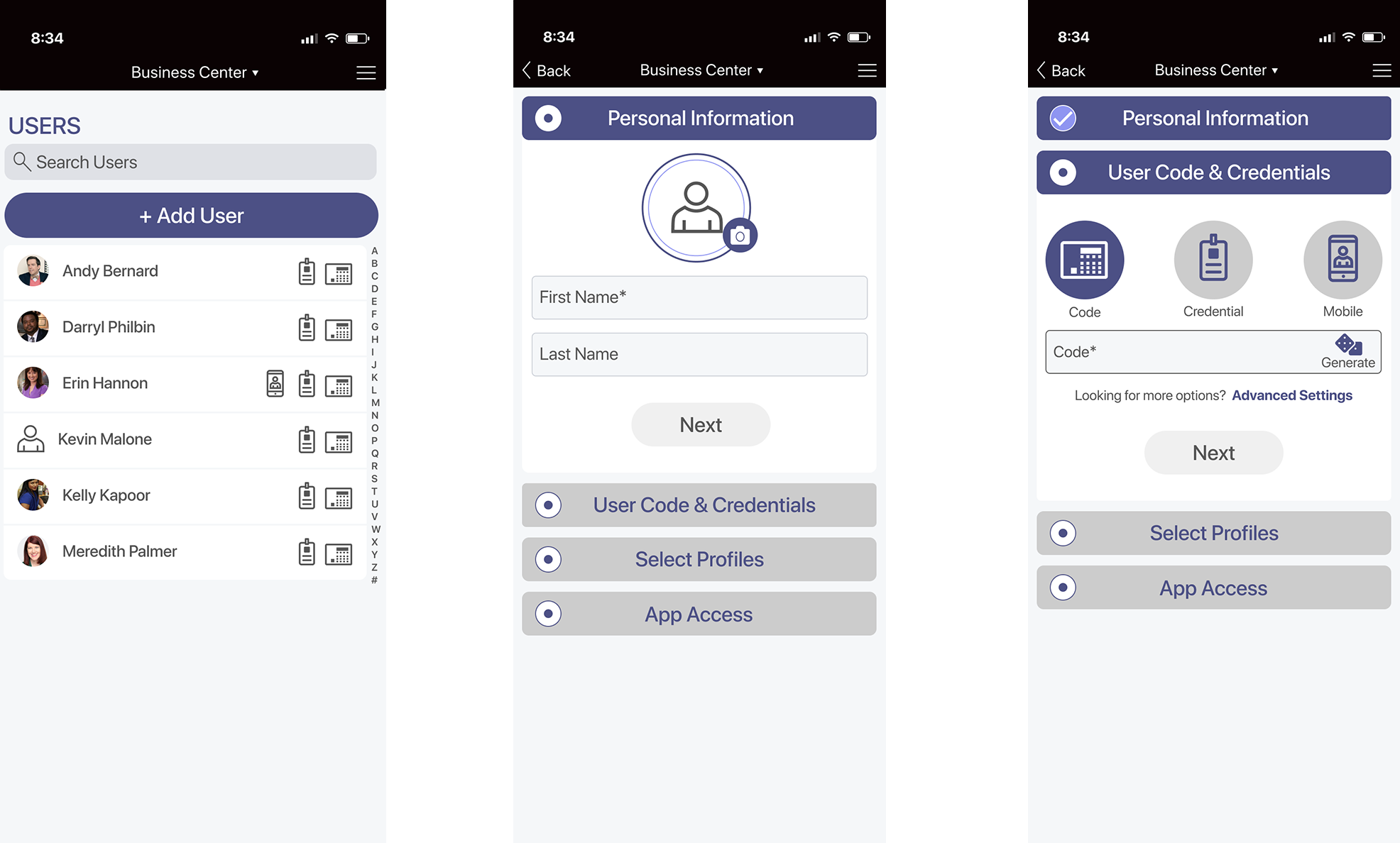
I started to explore the concept of developing an onboarding process instead of trying to gather all the user information from one screen. Breaking the workflow into onboarding steps allowed me to develop an architecture that could accommodate a primary and secondary workflow for more customization. Before mocking up a prototype I mapped out the proposed architecture and gathered precedents to share with product management to confirm the design direction prior to investing time developing a new user flow.

Primary User Flow and Architecture
With so many customization options it was important to consolidate everything into one location
Wireframe
Lo-Fi Sketches
Once we felt the architecture was organized properly it was time to develop lo-fi sketches for feedback. After spending time gathering competitive research, collecting inspiration from sites like Dribbble, and creating some hand sketches, I moved to Figma to start to develop a concept that would keep the user onboarding experience streamlined, organized, and add more value to users.
I shared the prototype with members of technical support and the dev team for internal user testing and feedback. During the internal testing I tracked what features users interacted with and quantified them. This allowed be to use data to confirm which settings should be primary vs secondary.
Lo-Fi Sketch

Quantifying how often users selected a feature allowed me to use data to prioritize which features should be primary vs secondary
Advanced Settings went through multiple iterations
The lo-fi wireframe allowed me to play around with transitions and quickly get feedback from dev on how feasible my concepts would be to code
Prototype
High-Fidelity Wireframes
User Interviews
After making adjustments to the wireframe I updated the dev team to understand if they had any feedback to share before developing a hi-fi mock-up and spec. Once developed, I shared the prototype with a few customers and internal staff for feedback.

Hi-Fi Prototype
This is the hi-fi prototype I developed for user interviews
Design Iterations
In a final review with product management, I organized the various feedback from users and we reviewed each screen. This provided an additional opportunity for management to provide design direction, taking into consideration user feedback, before handing over to dev.

Documenting Feedback
Keeping organized notes from all the different stakeholders was key to ensure the design addressed everyone’s feedback
Ship It!
Final Product
Value Added
After two design sprints the design was ready to be developed into a spec to share with engineering. Keeping dev in the loop throughout the design process simplified the handoff process and reduced the amount of time required for engineering to create a shippable product.
We added value to the customer experience by:
Providing structure and organization by developing a new onboarding architecture
Improving efficiency of the onboarding process by reducing the amount of time required to onboard a user
Using research-backed design to determine platform organization
Improving visual style by ensuring colors and text are accessible

Before

After
User Research was key to informing design changes and improving the customer experience
Closing Thoughts
Reflection
The revised user onboarding was well received by our customers. However, there are always improvements to be made. If given more time, I would like to do more user research with customers to determine how we could continue to streamline the architecture and better organize the customization options we offer.
Our product is unique in that it assumes the user has already participated in training on security systems and has a baseline understanding of the terminology referenced in the onboarding process. However, I feel our designs should be manageable for anyone, regardless of security understanding and I believe additional usability testing would expose areas for improvement.