Video Verification
For First Responders

Enhancing our platform to provide first responders with a comprehensive understanding of security system alarms
Project Overview
Project Scope
Redesign + New Feature Implementation
Tools
Figma, Miro, Google Forms
Role
UX Designer
Challenge
Video Verification is a specialized service we offer our customers; Monitoring Center Operators. When a security alarm is triggered, the first responder is a Monitoring Center Operator. Their primary responsibility is to use our platform to analyze the security camera feeds to determine if the alarm activation is the result of a genuine intrusion or a false alarm. This first-line response approach is commonly known as Video Verification.
The primary challenge I faced was our existing Video Verification platform lacked an intuitive user interface and was not meeting Operators’ need to quickly and accurately respond to alarms. Furthermore, competing products in the market provided additional features that our platform did not include. My role as UX Designer involved understanding the unique needs of this user base and developing a solution to seamlessly integrate within our customers' daily operations, ultimately becoming an indispensable tool in their workflow.

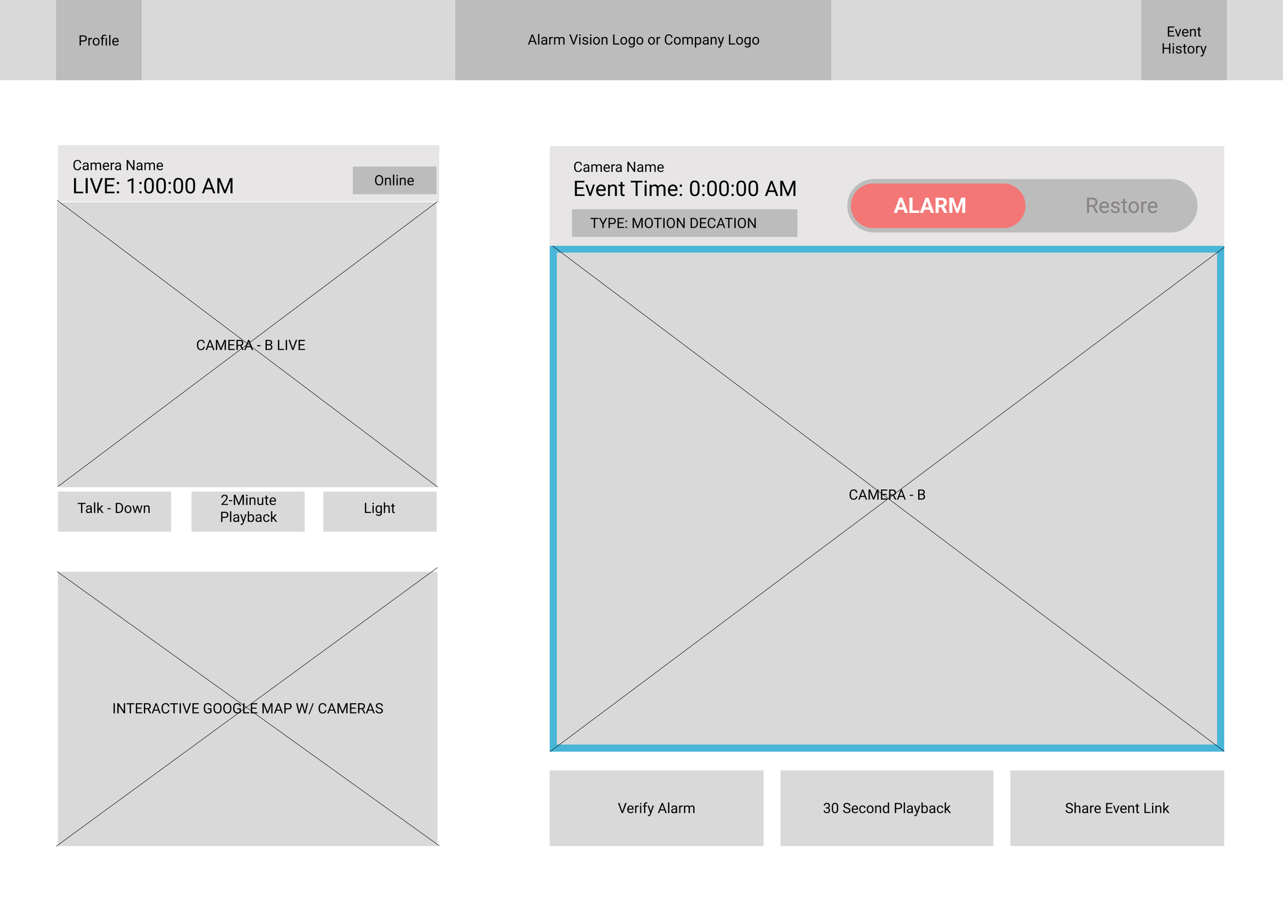
Redesigned Video Verification Page
Continue reading below to learn more about how this platform evolved!

Existing Video Verification Page
The existing page lacked organization and feature hierarchy
The front-end did not reflect our style guide, leading to further confusion
Solution
Given the critical role this product plays in supporting first responders, it was imperative to gain a deep understanding of the user and their workflow. I needed to understand How-Might -We....
Utilize user research to partner with Monitoring Centers to develop a top-tier product backed by industry leaders
Improve the UI to minimize the time an operator (user) views the page before responding to an emergency
Develop new features that will improve the user workflow, give us a market advantage, and provide our company with increased RMR (returning monthly revenue)
Redesign the page to better reflect our branding and design standards

Research
Preliminary User Research
User Interviews
Before diving into any design work I needed to gain an understanding or our users’ (Monitoring Center Operators) existing workflow. I conducted user interviews with six different Monitoring Centers focusing on how they utilized our existing Video Verification platform. The following trends emerged:

Preliminary User Interview Summary
Existing User Workflow
Once I had insight into the users’ needs I focused on understanding the user workflow when responding to an alarm event. I learned the key to responding to events efficiently and consistently is by following an action plan that guides the Operator through step-by-step instructions on how to respond to an event. This also helped me understand the touchpoints for when an operator would interface with our platform.

User Workflow
Operators refer to this workflow as an Action Plan
Market Research
Competitive Analysis
In addition to understanding our users’ needs and workflow I researched our competitors’ offering to evaluate their strengths and weaknesses. I reviewed this analysis with Product Management to start to identify what features we should focus on in order to give us a competitive market advantage.

Competitive Analysis
Studying our competitors identified opportunities to provide features that were unique to the market
Design
Information Architecture
Site Map
Moving into the design phase, I started by creating a site map that outlined the overall architecture of our platform. This allowed Product Management and our Dev Team to visualize the various features and confirm the scope of the redesign. Once we had and understanding of the time required to develop the various features we were able to prioritize which items we would focus on for for initial release vs future phases.

Video Verification Site Map
Product Management and Dev were able to scope out what features should be prioritized for initial release vs future phases
Wireframe
Lo-Fi Sketches
After the architecture was organized properly I developed lo-fi sketches for feedback. Taking into consideration the preliminary user interviews, completive analysis, inspiration from sites like Dribbble, and creating some hand sketches, I moved into Figma. The design prioritized keeping all functions accessible from the landing page and creating a layout that was intuitive to navigate.
Lo-Fi Sketch
Product Management specified that all features needed to be accessible without requiring the user to scroll
Iterate, Iterate, Iterate!
Consolidating information to one page
Highlighting the most recent event and live camera view for quick comparison
Providing hierarchy to primary information and secondary features
Ensuring intuitive page navigation
Once I created a mock-up for the team to review, I focused on How-Might-We improve the UI to minimize how long an operator (user) needs to view the page before responding to an emergency. The design went through several iterations as I focused on:

Design Iterations
Each iteration was reviewed internally by Product Management and Dev for feasibility and design direction
Prototype + Gather Feedback
User Research
User Interviews
After going through several design iterations internally I developed a hi-fi mock up and organized user interviews with ten Monitoring Centers to gather feedback. To ensure consistency and structure I developed a script in Figma that I presented during each call in addition to demoing the hi-fi mock up. The script allowed me to take live notes to capture feedback and encourage collaboration.

Hi-Fi Prototype

This is the hi-fi prototype I developed for user interviews
User Interview Script
The script provided organization and made it easy to reference later for feedback
Live notes encouraged participation during the interview sessions
Survey
As a follow up to each interview I sent a survey which allowed each user the opportunity to share feedback that they may not have felt as comfortable providing in person. It also provided the user an additional opportunity to share feedback they may have thought of after the formal interview.

Google Form
Each interview participant was sent a quick 2 minute survey after our call

Survey Findings
Later I summarized the survey results into infographics to quickly communicate findings with Stakeholders
Turning Findings Into Insights
Updating Stakeholders
It was important to keep Stakeholders informed of the user research and effectively communicate how the data collected influenced the UI and feature decisions for the platform. To achieve this I created a report which summarized the user research findings and shared it with our product management, marketing and the executive teams. This provided upper management with insight into what our team was developing, in addition to, keeping them informed of the relationships we had established with Monitoring Centers (our users) for future partnership and marketing potential. Always considering UX, I formatted the report focusing on graphics and content layout to ensure executives with little time, could quickly review the report and digest the key information.
User Research Report

This report became a resource to educate Stakeholders, Product Management and the Dev team on the unique userbase for this platform
Ship It!
Development
Creating Specifications
Video Verification was a specialized product that some members of the development team were unfamiliar with. Given its critical role in aiding first responders during emergencies, it was crucial that the specifications not only conveyed design intent but also provided developers with a clear understanding of the rationale behind certain feature developments. Creating a thorough spec was imperative to ensure that the product met the highest standards of design and functionality.
I structured the spec into three layers, progressively transitioning from general information to granular details:
Typical user workflow and prototype: Defined the typical workflow and outlined how each feature interacted with the other page elements
Feature key: Provided an overview of each feature and page hierarchy
Detailed feature specifications: Outlined precise behavior guidelines, including CSS details, handling of various states, error messages and other feature-specific considerations

UX | Dev Specification
This spec became the "Source of Truth" for teams to reference as the design evolved
Final Product
Value Added
Due to the complexity of this page, I collaborated with Product Management to divide the design into multiple phases. Phase one concentrated on UI enhancements and establishing the backend infrastructure to support subsequent features in future phases. This agile approach enabled me to continually collect user feedback with each release, ensuring ongoing adjustments and enhancements as the product evolved.
Phase 1 - We added value to the customer experience by:
Optimizing user efficiency by reducing Operators’ information retrieval time for alarm responses
Providing structure and organization to page layout for more intuitive user experience
Improving the visual style to align with our current branding standards and style guide
Introducing features to aid first responders and enhance user confidence during alarm responses such as: synchronized Live and Event Clip Viewing and a comprehensive Event Notification Log

Initial Release
The initial release focused on UI improvements and the addition of key features based on User feedback
Working in an agile environment allowed us to ship an initial release knowing additional features were soon to follow
Phase 2 - Will introduce additional features, strengthening our competitive edge in the market by:
Implementing UX research-supported features including: exterior camera overlay on Google Maps, user-verified alarm validation, and the recording of Operator actions in Event Notifications
Optimizing page layout to maximize contextual information available to operators during an alarm response
Designing for flexibility by enabling operators to customize page layouts for optimized response times
Evolving the page structure to maintain operator intuitiveness, ensuring that design changes do not hinder response times when features are updated

Future Release
User testing revealed that 98% of our users had monitors 1600px or wider, providing me with greater design flexibility
Closing Thoughts
What’s Next
The updated platform was very well received by Monitoring Centers, prompting discussions about potential partnerships with some of the Nations’ largest Monitoring Centers to tailor features to their requirements. These partnerships have the potential to create a new product line and source of revenue for our company. Furthermore, while initially designed as a feature for one product, the large amount of positive feedback has resulted in bringing these enhancements to our other video verification product offerings.
As with every design there is always room for improvement. I believe we can continue to push the boundaries on what is expected for the UI/ UX of more “functional software” like Video Verification. In addition, with the rapid integration of AI into our other product lines, I believe this product skims the surface on how we can integrate AI and other features to assist the Operators in assessing video events. I believe this will be the future of the security industry and we now have a platform that can serve as the launchpad into what the future of Video Verification looks like.