
Cheese Please

Transforming a Local Mom and Pop to a Global Online Shop
Project Overview
Project Scope
Responsive Website, Branding
Tools
Figma, Miro, Adobe Illustrator + Photoshop
Role
UX Designer (Research, Visual Design, Interaction Design, User Testing)
Challenge
Cheese Please is a small family owned and operated brick and mortar store in Prince George, BC. Due to growing popularity and the desire to reach a wider audience the owner would like to update their webpage and create an online presence that takes their shop from a local brick and mortar to the ultimate online platform for all things cheese!
Their goals for the website include: access to live online cheese making classes, a section for recipes, and an e-commerce section for cheese making supplies and cheese kits.
Solution
Define a unique brand identity that reflects Cheese Please’s attributes and creates a strong online presence to grow the existing business beyond the brick and mortar store
Design a website that meets the goals of the business and user
Integrate features into the website that separate Cheese Please from other competitors by creating a unique online experience for users

Research
Secondary Research
Market Research
I started my research by focusing on the Specialty Food Market’s consumer and business trends to better understand Cheese Please’s existing market and potential for expansion. These insights will help frame provisional personas and allow for more focused questions for in-person interviews.

Competitive Analysis
In addition to looking at market trends it's equally important to research other competitors in the space and evaluate their strengths and weaknesses. This will help identify opportunities for Cheese Please to emphasize as well as recognize pain points we want to avoid. Because online cheese making is such a small market I analyzed two direct competitors and one better known specialty food store for a holistic evaluation. Below is a summary of the results.

Primary Research
User Interviews
Using the information gathered from the market research and competitive analysis I developed three provisional personas to help in the creation of an Interview Guide. I then set out to my local specialty foods store and interviewed 6 participants to further strengthen my understanding of Cheese Please’s clientele. Below is a summary of my findings:

Empathy Map
To synthesize the data gathered from the user interviews, I created an empathy map on Miro to identify patterns across users, uncover insights, and generate needs.

User Persona
After reviewing all the primary and secondary research gathered, a clear picture of Cheese Please’s target user begins to emerge. I used the data that was collected to create a user persona which will become my reference point to ensure the new website addresses the major needs of the primary user group. Say hello to Nicki!...

Strategy
Defining the Problems
How Might We…
Now that we have identified our target user, Nicki, it is important to clearly define what specific problems we are trying to solve for in order to ensure the website meets the primary users needs. Using the insights and needs that emerged while analyzing the empathy map, I created Point-of-View (POV) Statements that then lead into goal-oriented How-Might-We (HMW) questions to guide brainstorming solutions.

Brainstorm
Individual Brainstorm
Next it was time to visit Miro and start to brainstorm solutions for the How-Might-We questions that were formulated above.
GroupBrainstorm

After brainstorming my own ideas I facilitated a group discussion with three participants to get their ideas and thoughts in order to gain a fresh perspective on possible solutions.
Strategizing
Product Goals
With so much new information gathered from the How-Might-We questions and Brainstorming sessions it was time to zoom back in and determine which solutions should be prioritized to meet the goals of Nicki and Cheese Please. By zooming in and creating a list of business and user goals I can start to determine the key features that should be integrated in the website.

Design
Information Architecture
Site Map
Once I identified the solutions that should be prioritized, I created a site map to define the overall structure of the website’s content. This allowed me to visualize the relationships between the various pages and ensure a hierarchy for easy and logical site navigation.

Next it was time to test the proposed Site Map and ensure it meets the needs of the user. To do this, I revisited Nicki’s persona and her goals and motivations. I then established a series of tasks that Nicki would likely visit the webpage to complete. Using Miro I was able to quickly ensure all the major elements of the webpage were accounted for in the Site Map. Below is an example of one task flow that was analyzed:
Task Flow
Task: Nicki wants to order a cheese kit for beginners.

User Flow
Building off the task flow, I mapped the user flow for each task to gain a better understanding of the decision points and actions different users may take to complete the same task. This ensured there were no dead-ends on the website and helped to create a clean site navigation for different user types. Below is the user flow for the task analyzed above:
Task: Nicki wants to order a cheese kit for beginners.

Wireframe
Lo-Fi Sketches
Analyzing the task flow and user flow maps; I established a UI Requirement Document that outlined the key screens I would focus on for lo-fi sketches. Through a combination of hand and digital sketching I worked through several iterations of wireframes until I felt confident with the design to move forward with a mid-fi prototype for user feedback. In addition to a desktop layout I also developed a mobile version to make sure the design was effective across multiple platforms.

Usability Testing
Once the prototype was completed I created a test plan which outlined key tasks that a user, such as Nicki, would most likely visit the site to complete. I then recruited participants to observe how they navigated the site to complete the test plan and observe areas of the design that could be improved. The feedback that was collected was then summarized and implemented into the design to optimize the user experience.

Branding
Getting Started
Now that the overall structure of the site has been revised to reflect the insights and recommendations that emerged from the user testing, the next step is to establish a UI kit that effectively communicates the unique brand of Cheese Please and is attractive to their target customers. I was able to utilize my experience as an architect to work with Cheese Please staff and target customer groups to identify what design elements were important to each user group and translate those into a UI Kit for the website.
I started by creating three distinct mood boards on Miro depicting different design styles for feedback: Stylized Minimalist, Playful Color Blocking, and Balanced Contemporary.

Miro allowed the different stakeholders to view the mood boards online and leave comments and like images they were most drawn to. Cheese Please stakeholders felt the “Playful Color Blocking” best reflected their brand. The words “fun, engaging, and inviting” were among the comments. The Stakeholders also liked “Balanced Contemporary” and noted they liked how “the images of products were the focus of the page and also acted as art and design elements”. Customers were also drawn to the “Playful Color Blocking” and said it was “bright, happy, and unique”.
Logo Refresh
Now that direction on the overall aesthetic has been set, it is important that Cheese Please’s logo reflect the new design standards as well. I began by analyzing the existing logo’s pros and cons and started to sketch out ideas that built upon the positive brand elements and reinforced their branding adjectives (listed in the UI kit below). Once a few concepts were decided on I moved to digital sketching in Illustrator for further refinements.

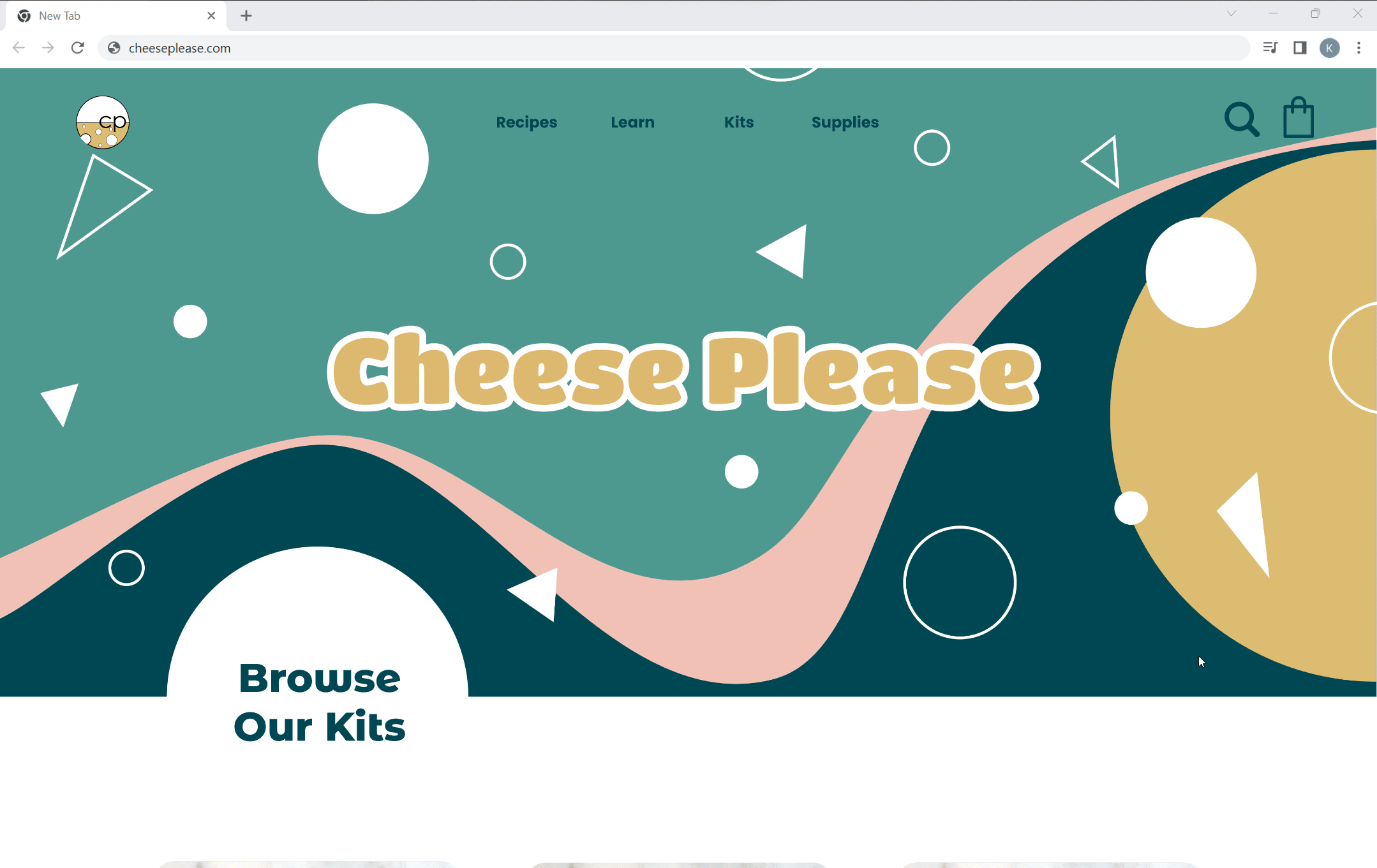
UI Kit
Utilizing the branding feedback above, I used the “Playful Color Blocking” and elements of the “Balanced Contemporary” boards as my inspiration to create a UI Kit that effectively communicated the brand attributes of Cheese Please.

Prototype + Test
Final Product
Prototype
The final step was to incorporate the UI Kit and other visual elements into hi-fidelity wireframes and a final prototype which reflect the branding and overall goals of Cheese Please. The prototype was then tested for a final round by users to ensure the site was functioning properly and met user expectations.

High-Fidelity Wireframes

Reflection
Final Thoughts
Reflecting on the final design, I believe I met the goals that were outlined at the beginning of the project. Cheese Please not only has a user-friendly website that makes it easy for customers to buy products and register for classes; they have a site that sets them apart from the competition by establishing a strong brand presence that caters toward their target customers. By creating a memorable online shopping experience I hope to see the design manifest into repeat customers and success for Cheese Please.